
Want to create an album cover that will wow your audience? Here’s everything you need to know about making the perfect album cover.
While people may not judge a book by its cover, you can’t say the same for albums. An album cover is like a window into the world you create with your music. A good cover can catch someone’s eye in a record store or on a streaming site.
Album covers are essentially a visual representation of your music. They give the listener some insight into what they can expect once they dive in. They also give you an opportunity to brand yourself as an artist, or to change your look entirely.
There’s so much you can do with an album cover, which is why it’s so important to get it perfect. First impressions last, and as an artist, you’ll see that your album cover is a major first impression.
A lot of big artists are known primarily for their iconic album covers. Whether it’s David Bowie, The Beatles, or Taylor Swift, artists have always used their album covers to reinvent themselves or to tell a story.
So what does a great album cover look like and how can you make one? In this guide, we offer you design tips for a winning cover, and a tutorial on how you can make your own cover seamlessly with PosterMyWall.
Before you start
Before you dive into the design process, stop and think about the direction you want to go in with your cover. Here are some important things to consider:
- The theme or genre of your album
- Your target audience
- Your identity as an artist
- How you define yourself and your music
- The kind of art other, similar artists have made
Design tips to keep in mind
Now that you have a vision for your album cover, it’s time to get started.
1. Choose a color palette
Colors play a big role in portraying moods, feelings, and emotions. Use color psychology to your advantage by pairing shades and tones that go with the genre of your music. For instance, happy, upbeat music is generally signified by warm or bold colors. Similarly, if you’ve made a blues or a grunge album, darker and more somber colors would be a good fit for you.
Use the color wheel to help you decide how to pair shades together. There are three directions you can go from here:
- Complementary – pick two colors that are polar opposites to one another e.g. blue and orange
- Analogous – pick three colors that are all similar in shade e.g. purple, dark blue and cyan
- Triadic – pick three colors that are all equally distant in shade from one another e.g. maroon, blue and orange

For more ideas on how you can use color to elevate your designs, check out PosterMyWall’s short color crash course.
When you present your album cover art, it should make listeners feel the way you want them to. Set the tone for your music through color, and have your fans follow suit.
Artist Soloman Jaye used the triadic color combination for his album “Ordinary Man”. The blend of yellow, blue, and green gives the cover a fun, festive vibe and is an indicator of the album’s music.

This album cover is a good demonstration of how color can give away the vibe and genre of the album. The tones of blue and black coupled with the dreariness of the backdrop are a clear indicator of what to expect once the listener dives into the album.

2. Font is important
Fonts work with colors to set a tone for your album. They’re often the first thing new listeners will see, so it’s important to get them right.
Stick to no more than two different fonts on one cover. Any more will look messy and unprofessional.
According to a survey done with various contemporary album covers, Sans Serif fonts are the most popular and the most effective on album covers. If you’re looking to pair this type of font with another, go with display fonts. Below are some famous display fonts:
- Medieval
- Geometric
- Stencil
- Typewriter
- Digital
Singer Frank Ocean used a Helvetica-style font on his album “Blond”. Helvetica is a Sans Serif font and is often used on album covers. Notice how neat, clear and fitting it looks with the album art and the muted colors.

PosterMyWall has a range of album cover templates and fonts that you can browse through and work with. The key is to experiment with different fonts until you find a pairing that looks perfect.
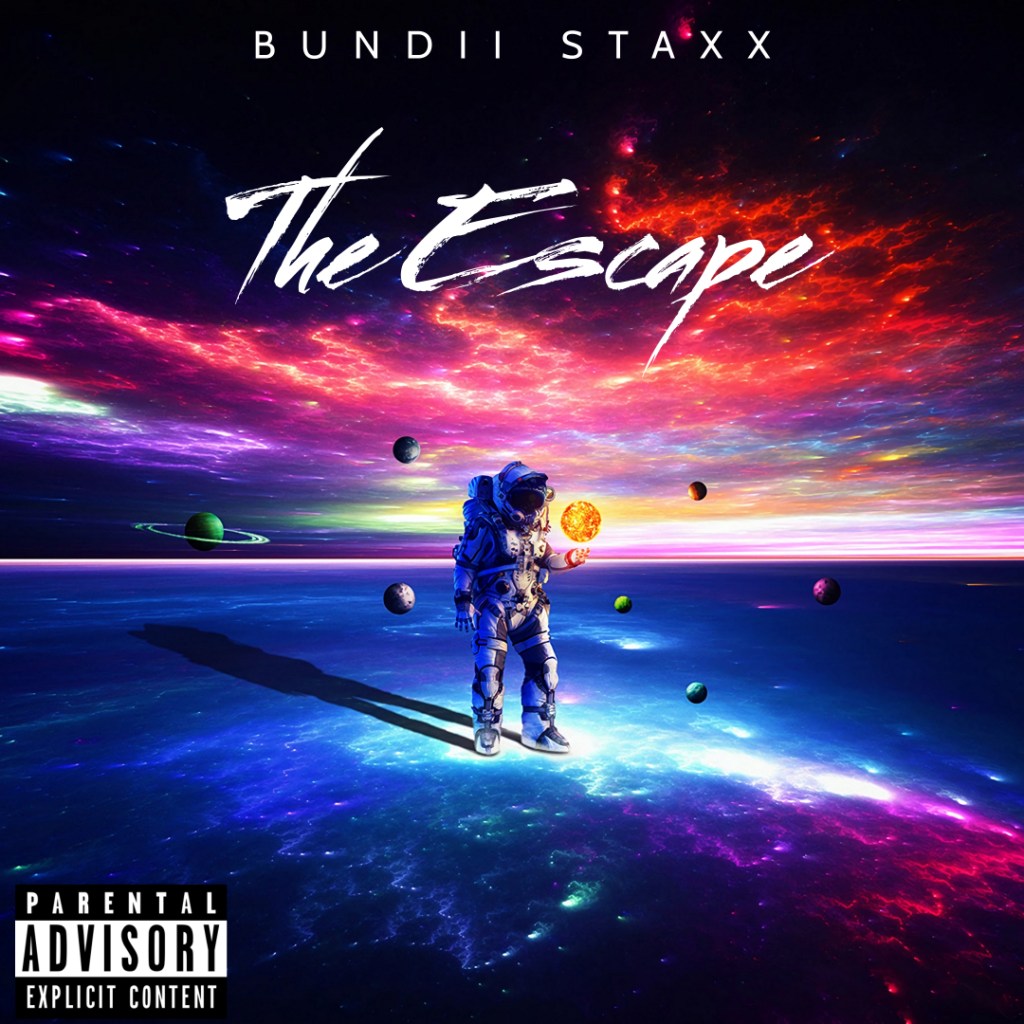
Take inspiration from this album cover that uses the font to successfully build on the vastness portrayed in the backdrop. In the same way, you can use the right font to complement the colors and images on your cover.
3. Pick effective imagery
Your album cover will either need a photograph or an illustration to make it look complete. Whatever option you go with, make sure that it blends neatly with the rest of the elements.
Make sure to color grade your photo according to the theme and color palette you choose. For instance, if you’ve chosen a pairing of warm colors, tint the photo accordingly to reflect that. Your photo or illustration should also complement the text you use.
Take a look at this album cover that uses color and an interesting “rags to riches” imagery to tell a story. You can see clearly that the two elements must work together for the cover to look complete.

Try a minimalist design
A lot of artists prefer to go for a minimalist option with their album covers, and to be fair, it’s not a bad one. You can say a lot with very little, without overwhelming your listener.
For a minimalist image on your cover, focus on subtraction i.e. take every unnecessary element out of your image. Leave a “curiosity gap” in its place. This is a gap that listeners should be able to fill with their own imaginations.
Make sure the image you choose is central and lone. All of the elements in it should be clear and complementary. Like the album cover for “The Black Album” by Metallica. The snake on the bottom right corner balances the text on the top left corner, while the colors signify the genre of the album.

The album cover below is an incredible example of how an album image can enhance your entire cover. The television, scratched paper, and shadow are all complementary elements that work with the color and text to create an eerie yet intriguing vibe. In short, the image is able to tell a whole story succinctly.

4. Think about sales
There are a couple of things you need to keep in mind in order to maximise sales and streams.
Make sure the artist and album names are written clearly on the sleeve of your cover so that it’s easy to see in stores and radio libraries.
The cover should also look good on Vinyl. A Vinyl record generally is about 12×12 inches so make sure the elements on your cover are big enough to be visible on it without looking too stretched out.
More importantly, let’s talk about streaming services. Here are the general guidelines to follow when designing a cover for different streaming sites:
- Minimum pixel size should be 1600×1600, however 3000×3000 is recommended
- Resolution should be at least 72 DPI, however 300 DPI is better
Your cover will also likely show up as a small thumbnail on hand-held devices so don’t crowd your cover with too many overlapping elements, and use highly-contrasted colors.
Note: It’s always best to use album art which contains your own original images and illustrations, rather than stock graphics. This allows you to make a bigger statement with your artwork, and show listeners that you care about every aspect of your music.
Take a look at Pink Floyd’s album cover for “The Dark Side of the Moon”. The striking colors, black background, and geometric shapes are clear cut enough for the cover to be resized and pixelated in multiple different ways without it losing its essence.

This template is a good example of how your cover can work for both big and small screens. It has small, detailed imagery in the center, however there is plenty of space on the side so that the cover doesn’t look too crowded.

How to create an amazing album cover
PosterMyWall’s template options and design tools allow you to make a cover that truly captures the essence of your music. Here’s how to go about it:
Step 1: Pick a template you like or search for a particular theme.

Step 2: Customize your text using the PosterMyWall editor. You can customize the opacity, font, font size, alignment, height, letter spacing, background, and shadow according to your needs.

We have a ton of font options for you to choose from. You can also upgrade to the Premium subscription plan to add any font of your own and get high-res album cover downloads for free.
Step 3: Now adjust the colors by changing the opacity and adding either solid or gradient colors, depending on your theme. You can also change the colors of the outlines of your images. Feel free to change the thickness of the outline or add a shadow.

Step 4: Add your image to your design. There are two ways you can do this:
- Add a custom image by clicking on “Photo” on the left side of the editor. From here, you can pick an image from your computer, stock photos, Facebook, Google Drive, or Dropbox.

- Go to “Elements” on the left side of the editor and add clip art, stickers, shapes, and even QR codes.

Step 5: Once you’re done with the design process, you can change the dimensions of your cover based on whether you want to print the cover out or post it online on streaming services and social media.
Simply click on “Resize” in the top blue bar, choose from the dimensions given or add your own custom dimensions.

Here are the size requirements for different streaming sites to help you with this step:
- Spotify – 640 pixels wide and tall, square
- Apple Music – 2400×2400 pixels, square
- Tidal – 1600×1600 pixels
- Deezer – 1600×1600 pixels
- YouTube Music – 2560 px wide x 1440 px tall
Step 6: download your finished design by clicking on the “Download” option in the top blue bar.

Final thoughts
Making an album cover is a creative process in its own right. But with PosterMyWall’s album cover maker, the process can be fun and painless. Just remember the four most important elements:
- Color
- Font
- Imagery
- Dimensions
As long as you get all of these right, you’re good to go. That too without the help of any expensive graphic designers.